Amplience
Rebrand: Icon & Logo
Amplience is the AI Content company that brings together data, performance insights and generative AI – helping enterprise-level businesses deliver persuasive content for every shopping context, fuelling truly personalised and connected experiences.

The story behind the icon
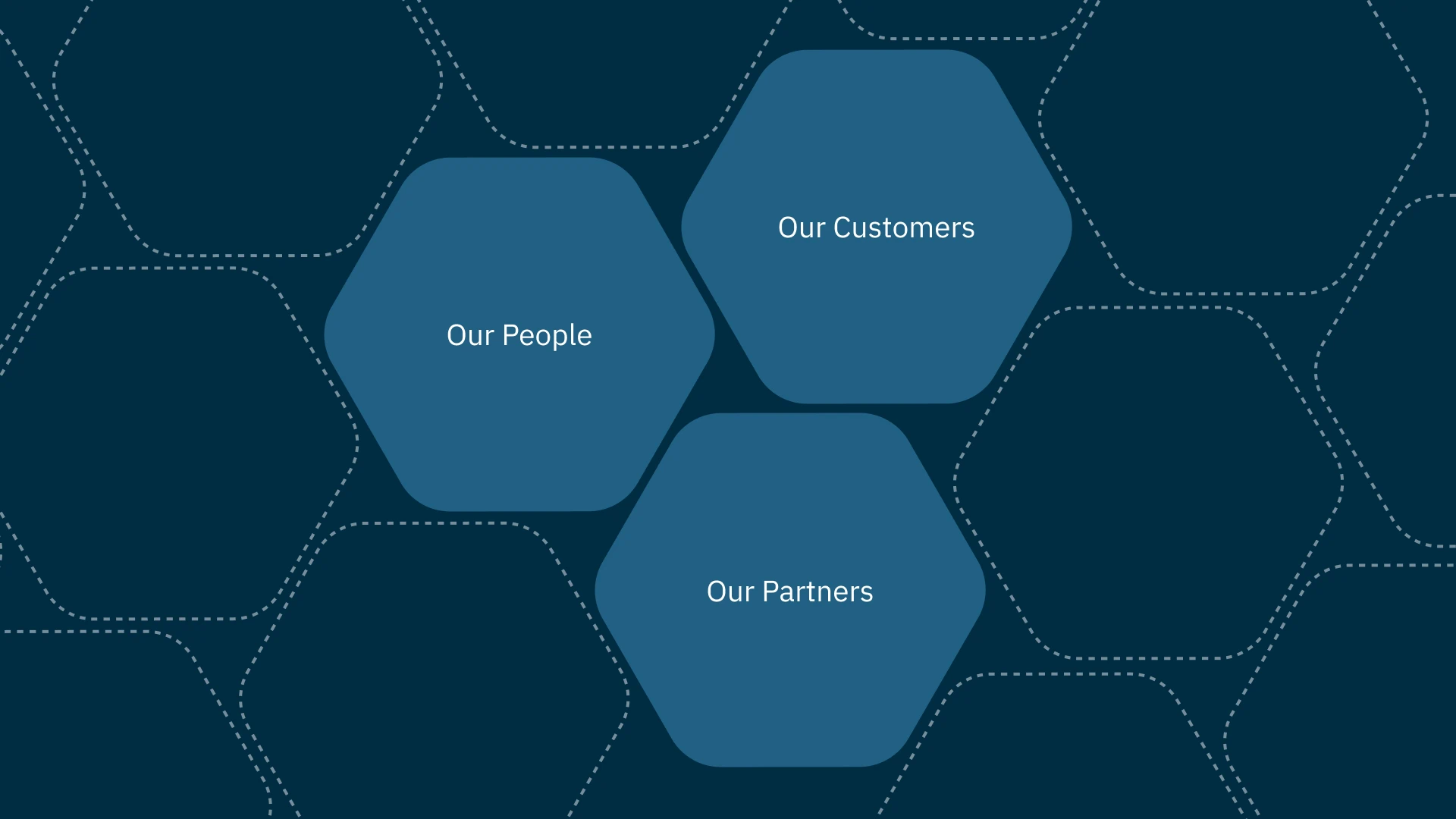
The icon, known for its simplicity and uniqueness, is composed of three distinct segments symbolizing Amplience's people, customers, and partners. When these segments come together, they form the letter "A" for Amplience. At the heart of the icon lies an open space, representing a dynamic area where ideas, challenges, and solutions can flourish. A place that embodies the essence of freedom.


Composability & creativity
The new icon is based on hexagons, which align well with the central concept of the Amplience product, composability.
Central to the icon is a void that signifies a vibrant zone for the growth of ideas, the tackling of challenges, and the development of solutions. An area that captures the spirit of creativity and liberty.


